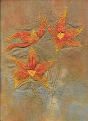
This is the piece that I did for Arlee for our Flickr challenge. Next time I will make sure that I have a greater contrast between the flowers and the background so that they don't get 'lost' as they do here. I was kinda working blind as I had the fabric sandwiched between soluble vylene to give it strength during sewing, and to allow me to draw my design on without putting it on the fabric. I am still pleased with my efforts though.

2 comments:
I quite like the subtle toning effect though! Would be interesting to build a series that was more contrasting too.
You could be onto something there. Each design could be slightly different and using different colours - that could be interesting. *note to self - keep this idea handy to give it a go*
Post a Comment